
Project Title:
Daily Step-Saver: Building Financial Confidence Through Micro-Saving
Client:
Horizon Bank is a Canadian online-only neobank aiming to serve younger and underserved users through flexible, emotionally intelligent tools.
Project Scope:
Design a single-feature experience that helps users develop better financial habits. The solution had to be simple, focused, and rooted in real user needs with the final deliverable being a working prototype, ready for development.
Team:
This was a two-person UX collaboration:
Johnny Bjurstrom (me): UX strategy, primary flow design, onboarding, and pitch development
Alexis Selvey: UX research synthesis, concept exploration, prototype interactions, and visual refinements
Tools Used:
Figma, FigJam, UXPilot, Adobe Creative Suite
Timeline:
4 weeks (Part 2 of a two-part UX design challenge)
Deliverables:
Fully interactive, high-fidelity prototype in Figma
Developer-ready design system components
Client-facing pitch deck with user research, testing insights, and business case
Full case study (this document)
The Challenge
Traditional banks often fail to connect with users who feel financially insecure, overwhelmed, or left behind. Horizon Bank saw an opportunity to reach underserved audiences (particularly younger Canadians and newcomers) by designing a tool that encouraged saving in a way that felt human, not judgmental.
“How do we help people who’ve never felt seen by traditional banks start saving with confidence, flexibility, and emotional safety?”
The broader context revealed a major gap: nearly half of young Canadians report feeling anxious when thinking about money. Many associate savings tools with guilt, pressure, or shame. Automation-based systems, like saving 10% of each paycheck, often feel cold or out of sync with the reality of inconsistent incomes or emotionally-driven spending habits.
Horizon Bank saw this gap and asked us to explore how we could build a more human, emotionally intelligent solution. The feature would need to be simple, self-contained, and built for first-time users. The goal was to provide immediate value while also laying the foundation for long-term engagement and brand trust.
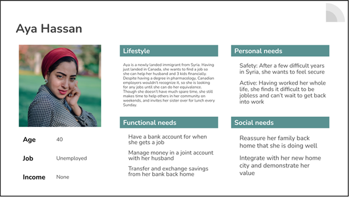
To keep our solution grounded in reality, we focused on two personas provided by the client. One was Yannick, a 24-year-old student who juggles classes and part-time gigs, often struggling to save consistently. The other was Aya, a 40-year-old newcomer to Canada who is cautious with her money and skeptical of financial institutions. Both shared a desire to build better habits, but neither felt that existing tools were made for people like them.
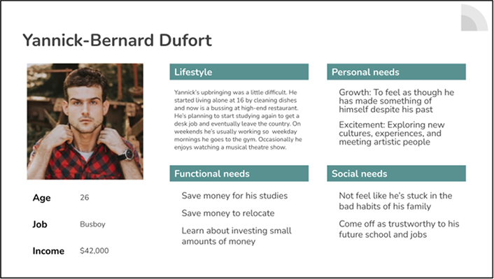
By focusing on these users, we had a clear lens through which to evaluate emotional tone, onboarding complexity, and day-to-day usability. Every aspect of the feature, from the name to the microcopy, was developed with them in mind.
Research & Insights
Our design direction was grounded in the user research provided by Horizon Bank. We began by reviewing the bank’s internal personas, each reflecting a different life stage, income level, and relationship to money. From these, we focused primarily on the personas. Both represented users who faced emotional and systemic barriers to consistent saving including uncertainty, low financial confidence, and a sense of being overlooked by traditional banks.
These personas led us to a central insight:
Users didn’t just need a savings tool. They needed a savings experience that felt encouraging, non-judgmental, and easy to integrate into their daily lives.
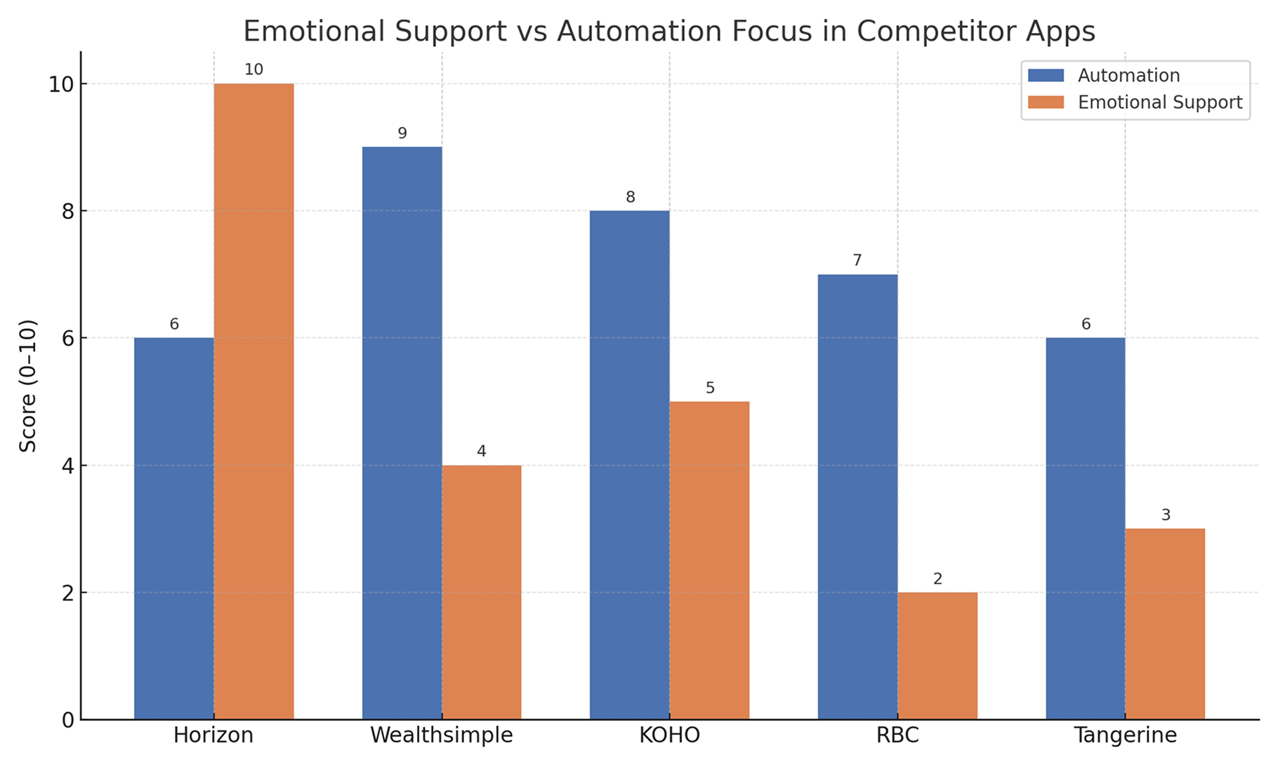
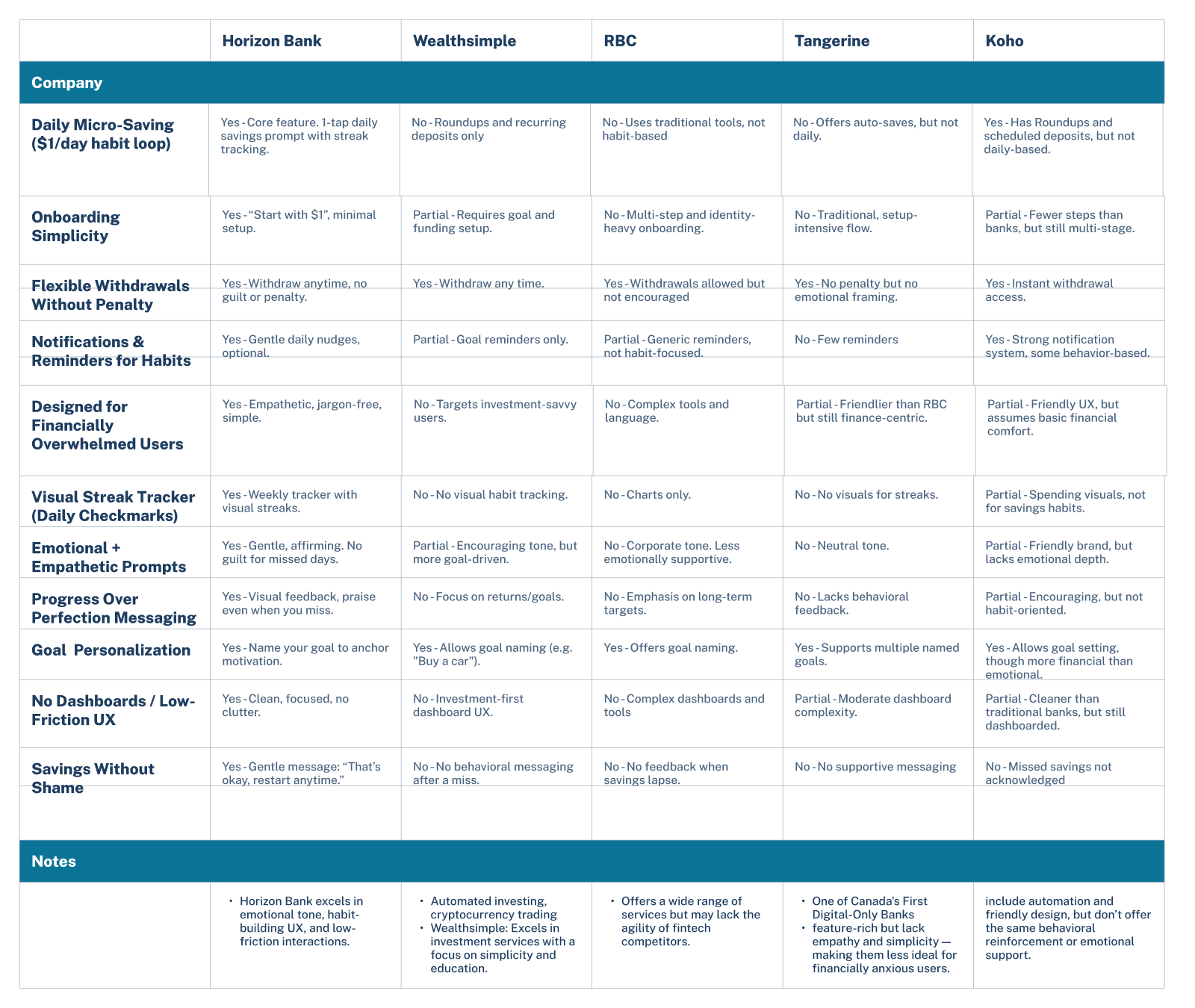
To explore how other platforms approached this, we conducted a competitive scan of digital-first banking apps such as KOHO, Wealthsimple, and Tangerine. While many of these apps included automation features, few offered the kind of emotionally intelligent savings experience we were aiming for. They tended to emphasize structure over flexibility, and progress over emotion, with little to no personalization or empathy built into their flows.
This gap in the market informed our design hypothesis: a low-pressure, habit-forming savings experience could better serve users with financial anxiety or inconsistent income. We also recognized an opportunity to differentiate Horizon Bank through a tone of voice that was motivational, not mechanical, and a UX that prioritized small wins over rigid routines. This research laid the foundation for our solution.
The Stats Link Back to Our Design
Every decision in the Daily Step-Saver was informed by user pain points and grounded in measurable business potential. These stats helped shape our approach:
- $1–$5 daily saving loops meet the 46% of Canadians living paycheque to paycheque, no lump sum deposit required.
- Instant pause and no-fee resets break the shame spiral we saw in our user map, reducing overdraft risk and churn.
- Gamified streak tracker taps into a proven 34% lift in daily engagement on micro-saving apps.
- Plain-language onboarding (<90 sec) boosts completion and drives CAC down to $25, compared to $120+ industry average.
- Micro-wins dashboard makes even $50 feel like success. Just like Acorns, where balances grew from <$100 to ~$1.4k.
- 1 in 3 users become bank clients over time, as trust builds through consistent, human-centered design.
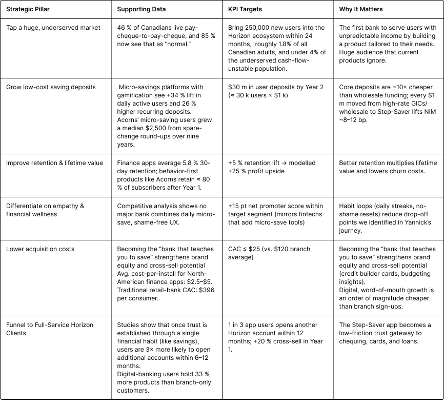
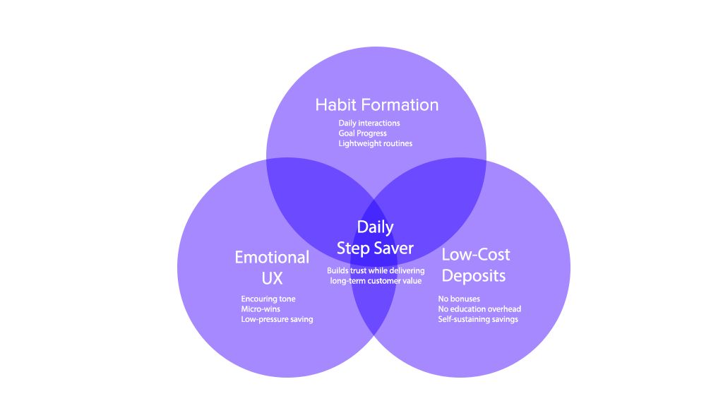
Why This Matters
By aligning emotional UX with proven KPIs, the product becomes a funnel for long-term user engagement and business growth.
From Concept to Craft: Designing the Daily Step-Saver
We started with a big question:
What would saving look like if it felt human?
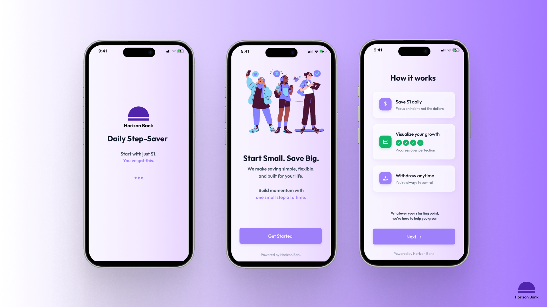
Although we initially explored a rule-based savings automation system, we ultimately prioritized a lighter daily savings approach that felt more emotionally aligned with our users’ lived experiences. This led to the development of the Daily Step-Saver; a tool designed to feel supportive, frictionless, and human. The goal wasn’t to build a dashboard. It was to build trust.
As we moved from early sketches to mid-fidelity wireframes, every design decision focused on removing friction, simplifying behavior, and encouraging emotional connection. We designed calm interactions, intuitive layouts, and built-in encouragement with a focus on gentle prompts and personalized affirmations.
Initial Sketches
Early ideas explored emotional reinforcement and flexible save logic.
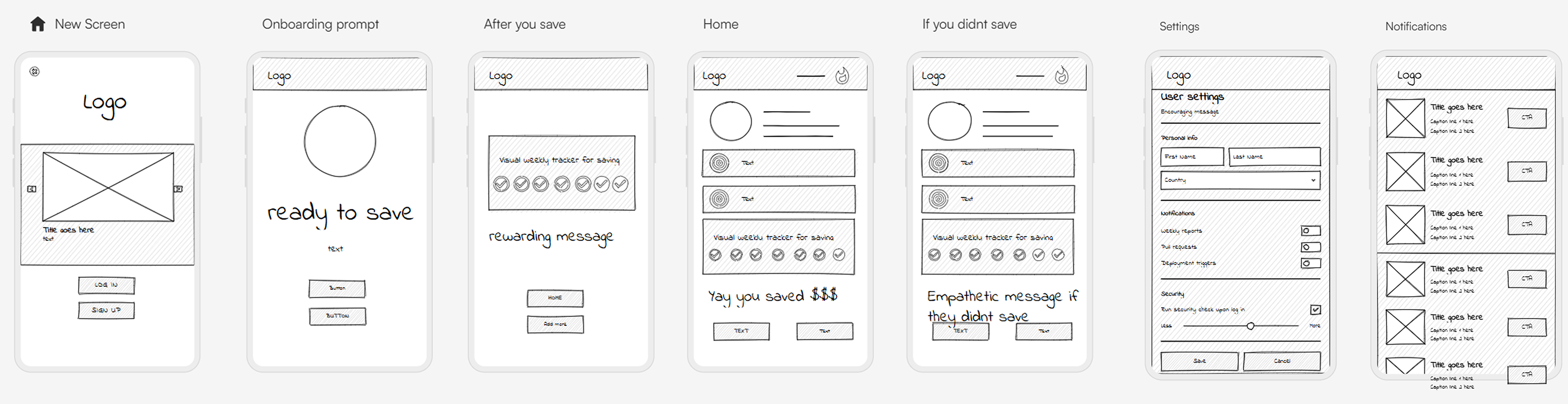
Wireframes
We mapped the full user flow with key interactions and message triggers.
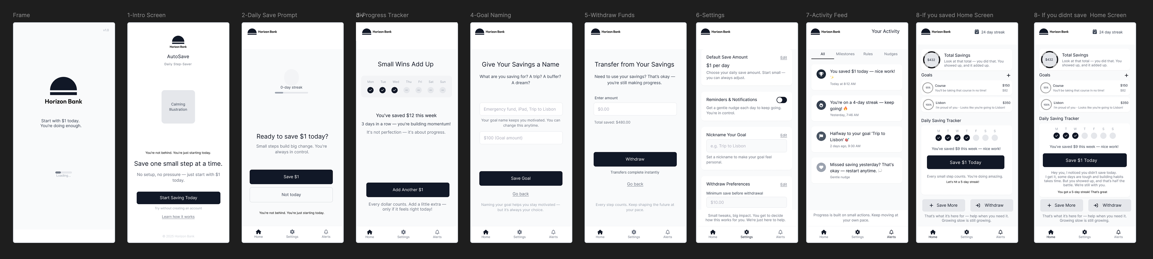
Final Design
Each screen was carefully reviewed to reflect our three core principles: flexibility, emotional safety, and simplicity. We made micro-adjustments to language, spacing, and visual hierarchy to ensure the design felt approachable while remaining bank-level trustworthy.
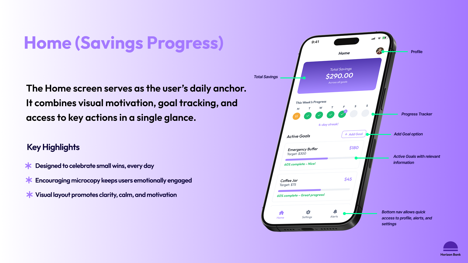
Home Screen Breakdown
Live Prototype
Usability Testing & Feedback
To evaluate the clarity, tone, and ease of the Daily Step-Saver experience, we ran a moderated usability test with five participants. Our goal was to go beyond surface-level usability and understand how people emotionally responded to the product. How did it make them feel? Was it approachable? Did it motivate them to engage?
Across the board, users described the app as clear, intuitive, and emotionally uplifting. They praised the navigation, felt comforted by the tone, and said the visual feedback made them feel proud after saving. This was exactly the response we were hoping for.
What Worked
Visual cues felt motivating, not overwhelming
“It made me feel proud of myself”
“It made me feel proud of myself”
Navigation was intuitive
“I feel like I could figure this app out in 4 minutes”
Emotional tone resonated
“It felt like a kindergarden teacher and personal trainer in one; gentle but helpful”
What Didn't
The pause button’s orange felt visually aggressive.
“The pause button kind of shouts at me — everything else feels so calm.”
Profile access wasn’t immediately intuitive.
“I kept looking for my profile in Settings. It took me a second.”
Users wanted deeper financial guidance.
“It would be cool if this helped me figure out what to do next with my money.”
After confirming the design’s emotional tone and usability resonated with users, we finalized the prototype and prepared it for handoff to developers.
Developer Handoff
We created a fully interactive Figma prototype using components with variants, basic interaction logic, and key animations to support a smooth developer handoff. While we repurposed elements from the Untitled UI design system to streamline our workflow, we adapted and customized them to match Horizon Bank’s brand and product tone.
The prototype is fully clickable, with all core flows represented and key edge cases accounted for. While we didn’t use auto layout throughout, the file is well-organized, and screen sequences are clear, making it understandable and buildable for a front-end developer. We recognize there’s still room for improvement. A future iteration would include fully responsive components and a more robust documentation layer. That said, the existing prototype delivers an actionable foundation and is ready for dev collaboration.
Impact & Opportunity
The Daily Step-Saver was designed to do more than help users save. It was built to foster trust, reinforce positive habits, and support people who often feel excluded from traditional financial tools. By reframing saving as a source of emotional reward rather than financial pressure, the experience helps users feel proud of their progress, no matter how small.
Features like motivational prompts, calming tone, and visual feedback create a low-friction environment that encourages users to return daily and stay consistent through action. The ability to pause or adjust savings adds a sense of control which is especially meaningful for those with inconsistent income or financial anxiety.
Business Opportunity
For Horizon Bank, this opportunity is just as meaningful. Step-Saver positions them not just as a neobank, but as a brand that genuinely understands the emotional side of money.
While other banks compete on interest rates or cashback, Horizon earns trust through experience. The tool is habit-forming, low-lift, and built for long-term engagement: no sign-up bonuses, no heavy onboarding, just daily deposits that build over time. That makes it not only scalable, but sticky and a unique chance to grow deposits and deepen relationships with users traditional tools often overlook.
Challenges Faced
Designing for simplicity was harder than expected.
There’s always a temptation to add more. More functionality, more logic, more clever interactions. But the real challenge was knowing what to leave out. Our early explorations included automation and rule-based savings logic, but the more we added, the more distant it felt from our target users’ reality. Stripping it back to a single, empowering daily action was a tough but essential decision.
Time constraints also forced trade-offs.
We didn’t have space for upfront user interviews, so we had to rely heavily on the existing personas and really squeeze insight from our usability testing at the end. That meant trusting our instincts at times and being rigorous about validating every small interaction through testing.
Staying aligned on tone was unexpectedly nuanced.
It was easy to write generic financial language. Much harder was crafting copy that felt human, warm, and never patronizing. Every screen had to strike a balance: informative, but never dry. Encouraging, but not cutesy. This part was one of the most collaborative sections of the project and deeply rewarding.
Reflection & Learnings
This project gave me the opportunity to design something simple and emotionally meaningful. While the interface was intentionally minimal, the strategy behind every screen, word, and interaction was layered and deliberate.
Working within tight constraints (one core feature, mobile-only, no onboarding friction) pushed me to sharpen my focus and make every element earn its place. I also gained a deeper appreciation for tone and microcopy as UX tools. Language had to do a lot of the heavy lifting: motivating users, normalizing setbacks, and celebrating small wins without sounding robotic or condescending. I spent almost as much time refining copy as I did layouts.
Finally, working in close collaboration with my teammate was a highlight of the process. We divided responsibilities, challenged each other’s thinking, and stayed grounded in what mattered most: creating something that genuinely feels good to use.
Conclusion
Daily Step-Saver was about removing the anxiety that keeps people from getting started. We designed something small, intentional, and human, for people who’ve never felt like banks were built for them. It’s proof that even a single feature, done well, can shift how someone relates to their money.
That’s what this project was really about.